Have you ever wondered how to make your handwriting look neat and professional? Learning how to write in block letters can be a game-changer, whether you’re crafting a sign, filling out a form, or just want to improve your penmanship. Block letters, also known as block capitals or print letters, are universally recognized for their clarity and legibility. In this step-by-step guide, we’ll walk you through the process of writing block letters, from selecting the right tools to mastering the technique. So, let’s grab a pen and get ready to transform your writing into clear, eye-catching block letters!
Contents
- Getting Started: Understanding the Basics of Block Letters
- Selecting the Perfect Tools for Writing in Block Letters
- Step 1: Setting Up Your Workspace for Optimal Writing
- Step 2: Mastering the Construction of Individual Block Letters
- Step 3: Achieving Consistency in Height and Width
- Step 4: Enhancing Legibility with Proper Spacing and Alignment
- Step 5: Adding Flair and Personal Touches to Block Letters
- Finalizing Your Block Letter Writing Skills: Practice and Patience
- Frequently Asked Questions
- In Conclusion
Getting Started: Understanding the Basics of Block Letters
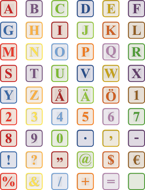
Block letters, also known as print or capital letters, are a fundamental aspect of handwriting. Mastering the art of block letters opens up a world of opportunities, from creating eye-catching posters to making personalized cards. To understand the basics of block letters, it’s essential to focus on three key elements: the shape, proportion, and spacing.
1. Shape: Block letters are characterized by their bold, rectangular forms. Each letter should be evenly shaped, with straight lines and sharp corners. When writing block letters, remember to keep your strokes consistent, ensuring that the width of each line remains the same throughout. This uniformity will give your letters a balanced and visually pleasing appearance.
2. Proportion: Achieving proper proportion is crucial for well-executed block letters. Each letter should occupy a designated amount of space on the writing surface, ensuring that they are not too small or too large in relation to one another. A useful trick is to divide each letter into equal imaginary sections to ensure consistent sizing. For instance, a capital ‘B’ can be divided horizontally into three equal segments, ensuring the first and second segments each contain one part of the letter.
3. Spacing: Paying attention to spacing is essential to create neat and legible block letters. Adequate space needs to be left between each letter, as well as between words. Aim for consistent spacing that is neither too tight nor too loose. Remember that spaces between words should be slightly larger than spaces between individual letters. Additionally, when writing block letters, it’s important to maintain a consistent distance from the top and bottom edges of the writing line to ensure uniformity.
By understanding the fundamental aspects of shape, proportion, and spacing, you’ll be well on your way to mastering block letters. Practice these basics while experimenting with different styles and techniques to develop your own unique lettering style. So grab a pen and paper, and let’s start exploring the world of block letters together!
Selecting the Perfect Tools for Writing in Block Letters
Writing in block letters can add a touch of elegance and uniqueness to your projects, whether it’s creating eye-catching posters or handcrafted cards. But to truly nail the art of block lettering, you need the right tools at your disposal. Here are some essential tools that can help you achieve stunning results:
- Pens and markers: Look for pens and markers with a chisel tip or a broad nib. These tools provide the perfect level of control and allow you to achieve consistent, bold lines. Experiment with different pen widths to add depth and dimension to your block letters.
- Pencils: Start your block lettering journey with a trusty pencil. They offer flexibility in sketching out the outlines before committing to ink. Opt for a mechanical pencil to maintain sharp lines throughout your project.
- Rulers and straightedges: Keeping your letters uniform and straight is essential in block lettering. Invest in a reliable ruler or straightedge to draw precise lines and maintain a professional look.
- Erasers: Mistakes happen, even to the most seasoned block lettering enthusiasts. Make sure to have a range of erasers handy, including kneaded erasers for smudges and precision erasers for fine details.
Remember, finding the right tools is just the beginning. Practice makes perfect, so take your time exploring different lettering styles and experiment with various materials. Whether you’re a beginner or a seasoned artist, the right tools combined with creativity and patience will help you create captivating block lettering pieces that are sure to impress.
Step 1: Setting Up Your Workspace for Optimal Writing
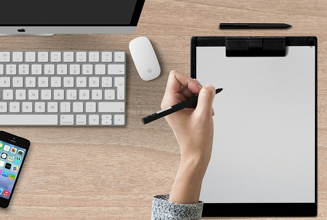
Now that you’re ready to embark on your writing journey, it’s crucial to set up your workspace for optimal productivity. A well-organized and comfortable environment provides the foundation for excellent writing. Here are some key elements to consider when setting up your workspace.
1. Get the right furniture: Start by investing in a comfortable chair and a spacious desk that will support your posture and prevent any strain on your body. Ensure that the height of your chair and desk allows for proper alignment of your arms, wrists, and computer screen, preventing any discomfort or pain.
2. Eliminate distractions: Minimize interruptions that could hinder your focus. Place your desk in a well-lit area and away from noisy areas in your home. Consider using noise-canceling headphones if you find external sounds distracting. Keep your workspace clean and clutter-free, as a tidy environment promotes mental clarity.
3. Optimize lighting: Natural light is ideal for a writing space, so position your desk near a window if possible. If natural lighting is not sufficient, invest in a good desk lamp that provides ample brightness. Avoid fluorescent lighting, as it can cause eye strain and fatigue.
4. Equip your workspace: Make sure you have all the necessary writing tools within reach. This includes a reliable computer or laptop, a notebook to jot down ideas, a comfortable keyboard, and a mouse. Organize your stationery in a desk organizer or drawer to keep everything organized and easily accessible.
By following these steps, you’ll create a workspace that promotes focus, comfort, and creativity. Remember, finding the right setup is essential for optimal writing conditions and will enhance your productivity throughout your writing journey.
Step 2: Mastering the Construction of Individual Block Letters
In order to master the construction of individual block letters, there are a few key techniques you should keep in mind. By following these steps, you’ll be able to create bold and eye-catching lettering for your projects.
1. Start with basic shapes: Begin by breaking down each letter into simple geometric shapes, such as squares, rectangles, and circles. This will serve as a foundation for constructing the overall structure of your letters.
2. Maintain consistent proportions: One of the essential aspects of block letters is their uniformity. Ensure that each letter maintains consistent proportions, making them visually balanced and pleasing to the eye.
3. Pay attention to spacing: Keep in mind that proper spacing between letters is crucial to maintain clarity and legibility. Leave adequate white space between individual letters to avoid crowding and improve readability.
4. Experiment with line thickness: Block letters often have thick, bold lines to emphasize their shape and make them stand out. Experiment with different line thicknesses to find the perfect balance between boldness and elegance.
Finally, practice, practice, practice! As with any skill, mastery of block letters comes with time and dedication. By consistently honing your construction techniques and experimenting with different styles, you’ll soon be able to create impressive block letter typography that truly captivates your audience. So grab your pen or stylus and start exploring the artistic possibilities that block lettering offers!
Step 3: Achieving Consistency in Height and Width
To achieve consistency in height and width on your website, there are a few key considerations to keep in mind. First and foremost, you’ll want to ensure that all your elements, such as images, buttons, and text boxes, have the same dimensions. This creates a balanced and visually pleasing layout for your users.
One way to ensure consistency is by using HTML classes. By assigning specific classes to elements that need the same height or width, you can easily apply styles to them across your website. For example, you can create a class called “same-height” and assign it to all the image containers on your site. Then, in your CSS file, you can use the “same-height” class to set a fixed height for these elements, ensuring they all have an equal height, regardless of their content.
Another important aspect is utilizing CSS flexbox or grid layout. These powerful CSS tools allow you to create responsive and consistent designs. With flexbox, you can easily align elements vertically or horizontally, making it a great choice if you want to achieve consistent heights within a container. Grid layout, on the other hand, provides more flexibility for arranging your elements in a grid-like structure, ensuring both height and width consistency.
Remember, achieving consistency in height and width not only improves the aesthetics of your website but also enhances user experience by providing a visually appealing and easy-to-navigate interface. So, give these techniques a try, and watch your website achieve a professional and polished look!
Step 4: Enhancing Legibility with Proper Spacing and Alignment
To ensure optimal legibility of your text, it is crucial to pay attention to proper spacing and alignment. By following these simple yet effective techniques, you can greatly enhance the readability of your content.
First and foremost, consider the spacing between lines. Adequate line spacing prevents your text from appearing cluttered and overwhelming. Use the CSS property `line-height` to adjust the space between lines. Increasing the line height slightly can make a significant difference in legibility by providing more breathing room for the text.
Next, focus on the spacing between letters and words. Use the CSS property `letter-spacing` to adjust the space between individual characters, especially if you are using a typeface with condensed or tightly packed letters. Furthermore, pay attention to the spacing between words. HTML provides the `word-spacing` property that allows you to control the space between words. Avoid excessive spacing, as it can disrupt natural reading flow, but ensure that words are not too tightly packed together.
Lastly, alignment plays a crucial role in legibility. Ensure that your text is aligned consistently, either left-aligned, right-aligned, centered, or justified. Pick an alignment that best suits your content and maintains visual consistency throughout your document. Unaligned or inconsistent text can be distracting to readers, making it harder for them to follow along smoothly.
By employing these techniques and adjusting spacing and alignment appropriately, your text will become easier and more enjoyable to read. Remember, good legibility leads to better comprehension and a more engaging experience for your audience. Start enhancing your content today with proper spacing and alignment!
Step 5: Adding Flair and Personal Touches to Block Letters
Once you have successfully crafted your block letters, it’s time to take them to the next level with some flair and personal touches. Adding these special details will make your letters stand out and reflect your unique style. Here are some creative ideas to consider:
1. Decorative Patterns: Use different patterns, such as polka dots, stripes, or chevron, to fill in the letter shapes. You can achieve this by either painting the patterns directly onto the letters or using patterned paper and gluing it on. Experiment with various colors and designs to find the perfect combination that matches your aesthetic.
2. Embellishments: Add some extra pizzazz to your block letters by embellishing them with various materials. Consider using glitter, rhinestones, sequins, or buttons to enhance the overall look. Place these embellishments strategically, either in a pattern or randomly across the letters, to create a visually appealing effect. The sparkle and shine will catch the eye and give your block letters a stunning finishing touch.
3. Hand-Lettering: If you have a knack for calligraphy or cursive writing, consider hand-lettering some words or phrases within the block letters. This personal touch will add an artistic element to your design and demonstrate your skill. Use a fine-tipped brush pen or a calligraphy pen to create elegant and flowing letters within the block shapes. Incorporate quotes, names, or meaningful words that hold significance to you or the intended recipient.
4. Themed Accents: If you’re creating block letters for a specific occasion or event, consider adding themed accents. For example, if it’s for a birthday, attach small balloons, paper confetti, or cut out festive party hats and glue them onto the letters. If it’s for a baby shower, add miniature pacifiers or baby booties. Get creative and think outside the box to tailor your block letters to the theme and purpose.
5. Dimensional Effects: Take your block letters to another level by adding a three-dimensional twist. Use foam sheets or cardboard cutouts to create raised areas on the letters. For instance, if you’re designing the letter ”A,” you could add a triangular roof-like structure on top to make it resemble a house. This technique will add depth and visual interest, making your block letters truly unique and eye-catching.
Remember, the most important aspect of adding flair and personal touches to your block letters is to have fun and let your creativity shine. Experiment with different materials, colors, and styles to create a piece of art that reflects your personality. Whether it’s through decorative patterns, hand-lettering, or themed accents, these enhancements will transform your block letters into a personalized masterpiece. Embark on this exciting journey of customization and watch as your letters come to life with flair and creativity.
Finalizing Your Block Letter Writing Skills: Practice and Patience
Enhancing Your Block Letter Writing Skills: Practice and Patience
Mastering the art of block letter writing requires dedication, perseverance, and most importantly, practice. While it may seem daunting at first, with time and patience, you can become proficient in this timeless form of written communication. Here are some tips to help you refine your block letter writing skills:
- Start with the basics: Begin by understanding the fundamental principles of block letter writing, such as uniformity, even spacing, and clear lines. Ensure each letter is formed using straight, vertical, and horizontal lines to maintain consistency throughout.
- Use guidelines: To maintain alignment and keep your block letters uniform, it is recommended to draw light guidelines with a pencil before starting. These guidelines will serve as a visual reference and help you achieve a cleaner and more polished result.
- Practice letter structure: Familiarize yourself with the structure of each letter by studying examples, tracing templates, or referring to instructional resources. Pay close attention to details like the proportion of each stroke, the shape of serifs, and the spacing between letters.
Remember, everyone starts somewhere, and it is normal to make mistakes along the way. Embrace the learning process and keep practicing to see continuous improvement in both your precision and speed. With perseverance and a determined mindset, you will soon be able to create impressive block letter compositions. So, pick up your pen and let your journey to block letter mastery begin!
Frequently Asked Questions
Q: Why should I learn how to write in block letters?
A: Learning to write in block letters has several advantages. Firstly, block letters are clear, neat, and easy to read, making them an ideal choice for many situations. Whether you are filling out forms, creating posters, or even jotting down notes, block letters ensure that your message is easily decipherable. Additionally, mastering block letters can be incredibly helpful if you ever need to communicate with people who have visual impairments or difficulty reading cursive handwriting.
Q: What are the basic steps to write in block letters?
A: The process of writing in block letters involves a few simple steps. First, gather the necessary materials like a pencil, eraser, and a sheet of lined or unlined paper. Next, decide on the size of your letters and space them evenly, maintaining consistent height and width. Use straight lines to form each letter, making sure to keep them clear and distinct from one another. Lastly, practice regularly to improve your skills and make the process feel more natural.
Q: How can I ensure consistency in the size of my block letters?
A: Consistency is key when it comes to block lettering. One practical tip is to start by drawing guidelines, using a ruler or a straight edge, to help you maintain a uniform height and width for each letter. You can also try lightly drawing a “bounding box” around each letter to ensure consistent spacing between them. Over time, with practice and repetition, you will develop a better sense of proportion and it will become easier to create evenly sized block letters.
Q: Should I write in capital or lowercase block letters?
A: The choice between capital and lowercase block letters depends on the context and personal preference. Capital block letters are often used for titles, headings, or when you want to emphasize a word or phrase. On the other hand, lowercase block letters can lend a more casual feel and are commonly used for general writing, notes, and messages. You can experiment with both styles and choose the one that suits your needs or the specific situation.
Q: Are there any common mistakes to avoid while learning to write in block letters?
A: Yes, there are a few common mistakes to watch out for when learning block lettering. One of them is inconsistent spacing, where some letters appear too close together or too far apart. To avoid this, it is crucial to make use of guidelines or bounding boxes to ensure consistent spacing between letters. It is also important to maintain consistent letter height throughout your writing. Another mistake to avoid is using too much pressure while writing, as this can cause the lines to become thick and uneven. Finally, remember to relax and maintain a comfortable grip on your writing utensil to achieve smoother and more natural-looking block letters.
Q: Are there any resources available that could help me improve my block lettering skills?
A: Absolutely! There are various online resources, tutorials, and even video demonstrations available that can help you enhance your block lettering skills. Websites, such as calligraphy or lettering blogs, often provide step-by-step guides, printable practice sheets, and tips from experts. Additionally, instructional videos on platforms like YouTube can also serve as an excellent visual aid in understanding the techniques and nuances of block lettering. Remember, practice is key, so make use of these resources and dedicate some time each day to honing your block lettering skills.
In Conclusion
In conclusion, writing in block letters is a useful skill that can enhance clarity and make your writing more legible. With practice and patience, anyone can master this technique and improve their communication. Happy writing!


